
Forms are an essential part of the digital landscape: if you sell products online, your customers will need to complete a checkout form. If you ask your clients to register on your website, again they will need to complete a form.
However, if your form doesn’t perform very well, you’re at risk of losing potential business, so it’s important to get forms right. Here are 12 tips to optimise your forms and improve your conversion rates that we’ve picked up over a decade of form optimisation at Zuko.
1) The “Submit” button is extremely important
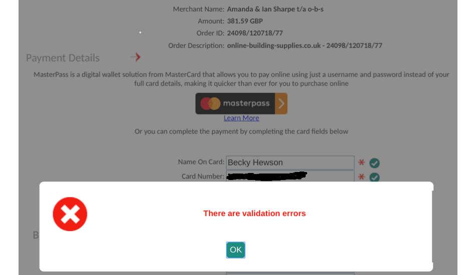
Your user has taken the time to complete your form, has clicked on the Submit button and, alas, they haven’t been able to successfully submit it. Error messages have probably been triggered at this point: your users may return to the problem fields and correct the errors, but there is a risk that users leave the form and you’ve lost a very warm prospect.
When analysing your form data, pay particular attention to your users who have interacted with the submit button but have then abandoned your form:
- Which error messages appeared in their session?
- Which fields did they return to?
- Did they demonstrate looping behaviour between your submit button and certain fields?
- Are there any elements that appear on your form that may have distracted your users?
- How many submit attempts did your users make before giving up?
These insights will help you to identify the issues that prevent users from submitting right at the sharp end of the funnel. Abandonment around the submit button is money left on the table, so this requires your utmost attention.
2) Use inline validation on your form
There’s nothing more annoying than clicking on submit, getting a generic “There is an error on the form” message, and then having to crawl back through a form to find where the problem is. If there are problems with a field, use inline validation to give immediate feedback so the user can correct it while they’re still there and move on. Don’t wait until they click on the Submit button to inform them of fields they last interacted with 10 minutes ago! Here are some numbers to show just how beneficial inline validation can be:
- A 22% increase in the conversion rate.
- A 22% drop in the number of errors.
- Improved user experience: a 31% increase in user satisfaction.
- A 42% decrease in the amount of time users spend on your form.
3) Make sure your form is to the point: avoid elements that may distract users
Pay great care to remove anything from the page which is liable to distract users from submitting the form: this includes any ads, offers or pop-ups. Make the form as clear and concise as possible to guide your users towards submitting it rather than throwing any unnecessary obstacles in their way.
4) Error messages should be useful!
If your error messages don’t explain the issue clearly, then they aren’t useful and may end up increasing user frustration. They should be clear and explicit in explaining the specific issue so your user can quickly identify and fix the problem. Here are some general tips:
- The error should be clearly visible: use red text.
- Avoid any ambiguity: the error message should explain the problem and how to fix it.
- Clearly indicate where the error is: don’t leave it to your user to find it.
- Use copy around fields to reduce the occurrence of error messages: using an example response or some explanatory text can help to manage user expectations, reducing the likelihood of user error.
5) Passwords
Although they’re often a necessary feature of many types of forms, password fields are often disliked by users, so care should be taken to make sure that password fields do not impose conditions that are too onerous. Otherwise you increase the likelihood that users will give up trying to create a satisfactory password and abandon the form.
- Strike the right balance around password conditions that maintain security but don’t create unnecessary obstacles for the user. Otherwise the user will be focusing on creating a password that conforms to your conditions rather than something they will remember later.
- You may decide to offset freeing up some more onerous password conditions by blacklisting some common user passwords (eg. “123456”).
- Use inline validation to communicate clearly whether the password meets all conditions or not.
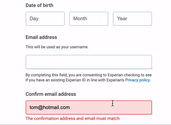
- Remove “Confirm Password” fields: it adds nothing to security (users will likely just copy and paste) but adds an extra obstacle to successful completion of your form.
- If the password field is masked, give users the option to unmask it.
- Consider using alternative solutions, such as magic links or one time password (OTP) sent to a phone.
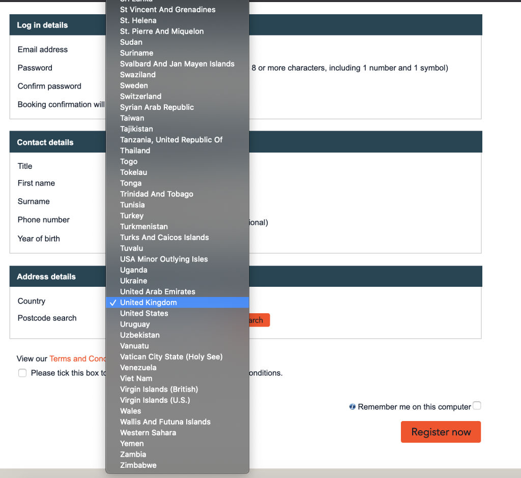
6) Avoid using dropdowns when there are alternative options
If you have a defined list of possible responses to a question on your form, a dropdown menu may appear to be the best solution if the list is too long to use simple radio buttons.
However, this is not always the best solution, especially when considering that the majority of your users may be accessing the form from a mobile device. For example, if you ask for a date of birth or a country of residence, a dropdown format may result in a significant amount of scrolling to find the correct year or country. Put great thought into what is going to be the easiest way for your client to input their information: in the case of a country, this may be a country finder; for date of birth fields, simply use separate text boxes for the day, month and year.
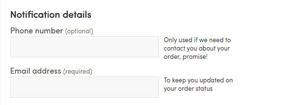
7) Make intelligent use of copy to guide your users through the form
Copy can serve a valuable purpose in guiding users through your forms and, if it is used effectively, it can help to reduce the frequency of error messages and increase the conversion rate of your form.
Here are some advantages of using copy:
- Informing users of any specific information or documents they will be asked to provide before they begin the form.
- Giving more detailed information about the nature of the information being asked if this isn’t fully clear in the question, or an example response.
- Explaining a required format if your field has format requirements (eg. DD-MM-YYYY).
- Encouraging users to commit to actions that may be optional. For example, if you have a checkout form that allows a user to complete their purchase without creating an account, copy might be used to encourage registration to speed up future purchases.
- Reassuring the user. If a field is sensitive in nature (eg. asking for contact information), copy can be useful in explaining why you need this information and the circumstances in which it will be used.
8) Be flexible in allowing multiple user inputs and formats
Telephone numbers, bank cards and postcodes are often sources of form friction and abandonment. This isn’t necessarily because users are not able to answer the question, but rather that forms often impose strict formatting rules that can frustrate users.
Let’s take the example of a card number: a user is trying to buy a product from your e-commerce store, they input their card number with spaces after each set of four numbers and the purchase is refused because of a “formatting error”. An error message then appears advising them to input their card number again in the “correct format”. Great if your user has the motivation to start again but it’s unfortunate for you if they don’t!
Some users instinctively format their answers in specific ways: for example, for a UK telephone number, some users will leave a space after the first five numbers and others will simply give you a string of 11 numbers. Allow for this and reformat the input on the backend if necessary.
If you absolutely must impose a format on the user, use copy to advise them to avoid unnecessary errors.
9) Publish feedback, recommendations and client logos on your site.
Often potential customers will hesitate before committing to making a purchase or engaging with you: they’re interested in what you have to offer but they don’t know you and trust you.
Create consumer confidence by publishing positive feedback and recommendations, especially if you have any from well-known companies, as this will help to reassure users and reduce any scepticism.
10) Start with easier questions
Your form may have a lot of traffic but few users actually begin to complete your form. If the initial fields on your form ask for detailed or complicated information, think about rearranging the order of the fields to ask for “easier” information first that the user is more likely to have to hand (for example, an email address). This small change should encourage more users to start your form, which in itself will increase the chances that they complete it. It’s human nature to complete tasks already undertaken, so take advantage of this to get more users engaging with your form.
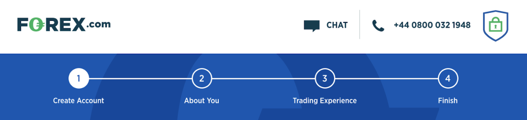
11) Use progress bars
Progress bars can have a positive effect on the users who want to know what the form will ask of them and how long it will take to complete. If they have visibility on the various steps this will help give a motivation boost to encourage them to complete it. However, it is important to get progress bars right. Here are some tips:
- Group similar questions together to give coherence to each step, then give this step a clear title (eg. Personal Information).
- Allow users to click on progress bar indicators to go back and edit or review them without them losing their data.
- Manage user expectations and be honest! Do not be tempted to create false hope in advising users that they are 70% through the form when in reality they are only 30% into it. This will leave a sour taste and drive abandonment.
12) Segment your data
It is extremely important to know where your visitors are coming from and in order to do so, you need to know how to segment your traffic. There are many types of software that can give you insight into this information- for forms, we would recommend zuko.io 🙂
Imagine that you have just launched a new marketing campaign but there is a panic going round the office as your conversion rates have tumbled. This is where it is essential that you know where your traffic is coming from: you may have attracted the attention of a large number of curious users, but whose motivation to engage is quite low. Knowing who to target is the key information you need to make sure your marketing strategy is targeted effectively.
If you manage to segment your audience effectively, you will quickly understand where your users are coming to your form from and most importantly, you will know which user types are most likely to convert. Don’t be disheartened if your marketing campaign appears to be attracting low-end users, as you may just be attracting an increased number of motivated users too: audience segmentation will show you this.
It’s now time to get your forms optimised! Conduct some research on the various tools that can help get you the insights you need, then once you have the evidence to make hypotheses, test out your changes using A/B testing.
If you’d like an idea of conversion benchmarks according to your industry, you can have a look at some aggregated sector data here. Don’t be bound by it or be disheartened if your form doesn’t yet reach the average- work on optimising your forms and the conversion rate will slowly but steadily rise.
Good luck!
